Photon Remote Temperature Sensor
This Tutorial is Retired!
This tutorial covers concepts or technologies that are no longer current. It's still here for you to read and enjoy, but may not be as useful as our newest tutorials.
 jenfoxbot
 Data Acquisition and Analysis
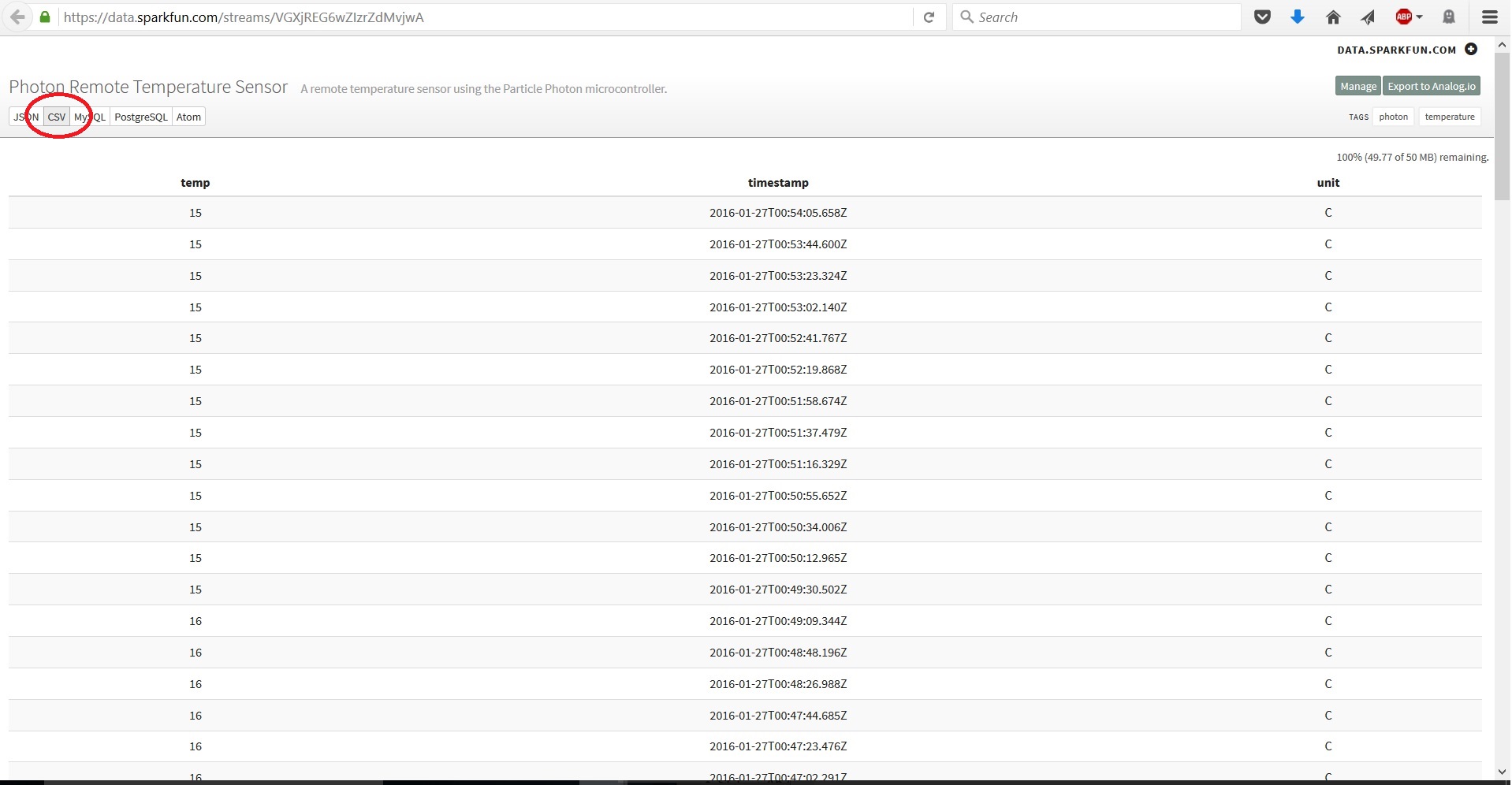
The data.sparkfun.com service allows you to download your data in a few different formats, so pick the format that is easiest for you to handle. Most common data analysis programs, including Excel, R, and Python, can handle CSV (Comma Separated Values) files.
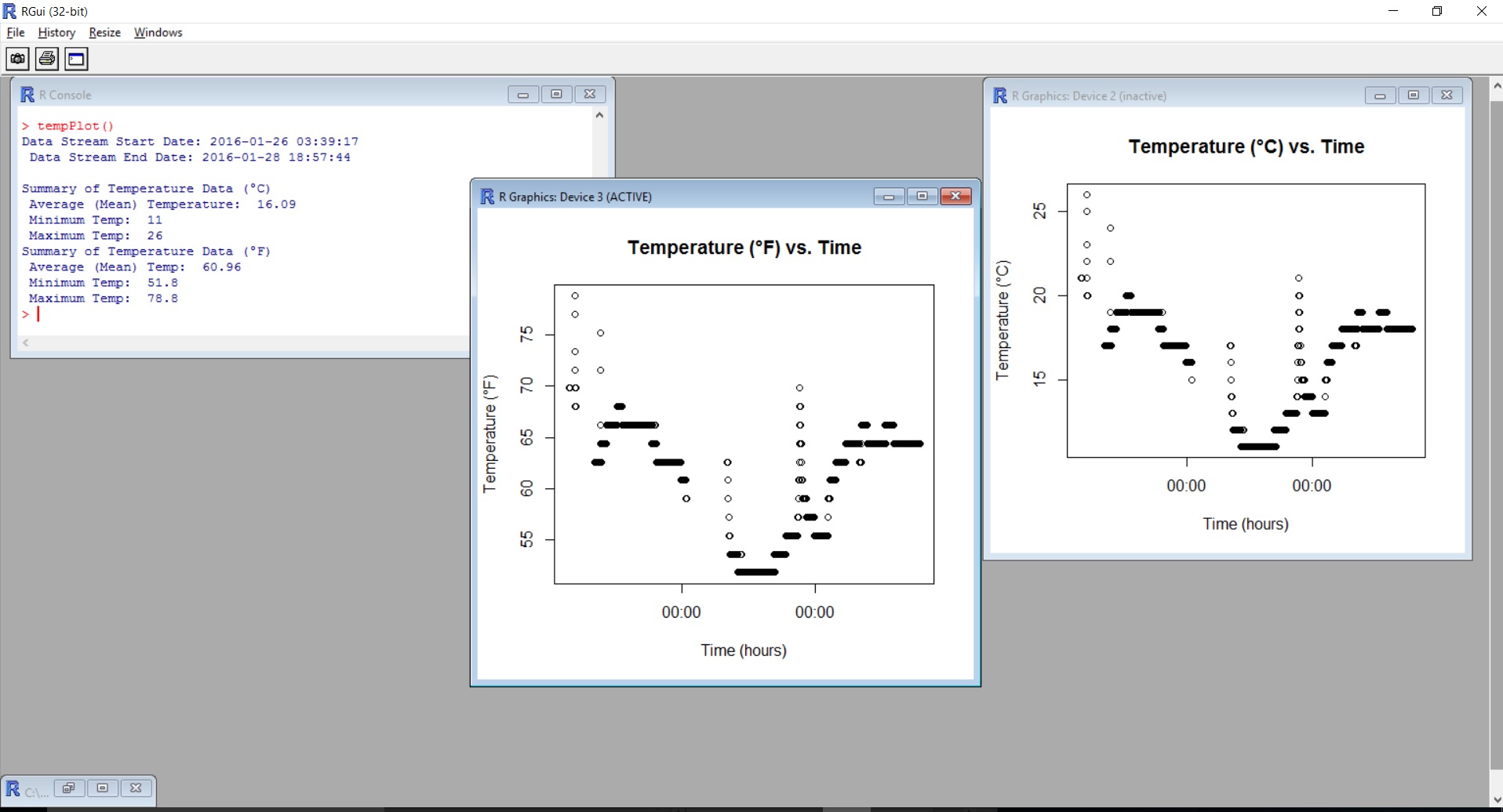
Below is one method to plot your data using a program written for the R platform, a free statistical software environment.
Download your data in CSV file format (button is located at the top of the data stream).
In the R workspace, run the program below to generate a plot and basic analysis of your data. You can also get the most up to date files from the GitHub repository.
#Photon Remote Temperature Sensor Data Plot and Analysis
#Code written by Jennifer Fox


tempPlot = function(file = ''){
    default = "C:\\test\\*.txt"

    #Load in CSV text file
    if (file == '') file = file.choose()

    #Set data into matrix
    headers = c("Temp_C", "Unit_C", "Timestamp")
    temp_raw = read.table(file, sep = ",", quote = "", skip = 1, fill = TRUE, col.names = headers)

    #Add in degrees Fahrenheit
    tempF = matrix(nrow = length(temp_raw[,1]), ncol = 2, byrow = TRUE)
    tempF[,1] = temp_raw[,1]*1.8+32
    tempF[,2] = "F"
    temp_raw[,c("Temp_F","Unit_F")] = c(as.numeric(tempF[1:length(tempF[,1]),1]), tempF[,2])
    temp = temp_raw[,c(1,2,4,5,3)]

    #Convert UTC timestamp into local (sensor) timezone
    timestamp_raw = temp$Timestamp
    ts_placeholder = gsub("T", " ", timestamp_raw)
    timestamp = gsub("Z", "", ts_placeholder)
    UTC_timezone = as.POSIXct(timestamp, tz="UTC")
    my_timezone = format(UTC_timezone, tz = Sys.timezone()) #Sys.timezone() outputs the local timezone

    #Replace temp data with local timezone
    temp$Timestamp = my_timezone

    #Plot temperature data
    plot(as.POSIXct(temp$Timestamp), temp$Temp_C, main = "Temperature (°C) vs. Time", ylab = "Temperature (°C)", xlab = "Time", xaxt = "n", pch = 20)
    axis.POSIXct(1, my_timezone, labels = TRUE) #Use the "format" argument to adjust the axis label (e.g. to print hours use: format = "%H:00" )
    dev.new()
    plot(temp$Timestamp, temp$Temp_F, main = "Temperature (°F) vs. Time", ylab = "Temperature (°F)", xlab = "Time", xaxt = "n", pch = 20)
    axis.POSIXct(1, my_timezone, labels = TRUE)

    #Calculate and output basic statistical analysis
    end_date = temp$Timestamp[1]
    start_date = temp$Timestamp[length(temp$Timestamp)]
    t_F = summary(as.numeric(temp$Temp_F))
    t_C = summary(as.numeric(temp$Temp_C))

    cat("Data Stream Start Date:", as.character(start_date), "\n", "Data Stream End Date:", as.character(end_date), "\n\n")
    cat("Summary of Temperature Data (°C)", "\n", "Average (Mean) Temperature: ", t_C["Mean"] ,"\n", "Minimum Temp: ", t_C["Min."], "\n", "Maximum Temp: ", t_C["Max."], "\n")
    cat("Summary of Temperature Data (°F)", "\n", "Average (Mean) Temp: ", t_F["Mean"] ,"\n", "Minimum Temp: ", t_F["Min."], "\n", "Maximum Temp: ", t_F["Max."], "\n")
}
The following shows the plots from the set of data collected during this project.