Lessons in Algorithms
 Nate, barryjh
Walking the Signal Processing Chain
Delays Due to Filtering
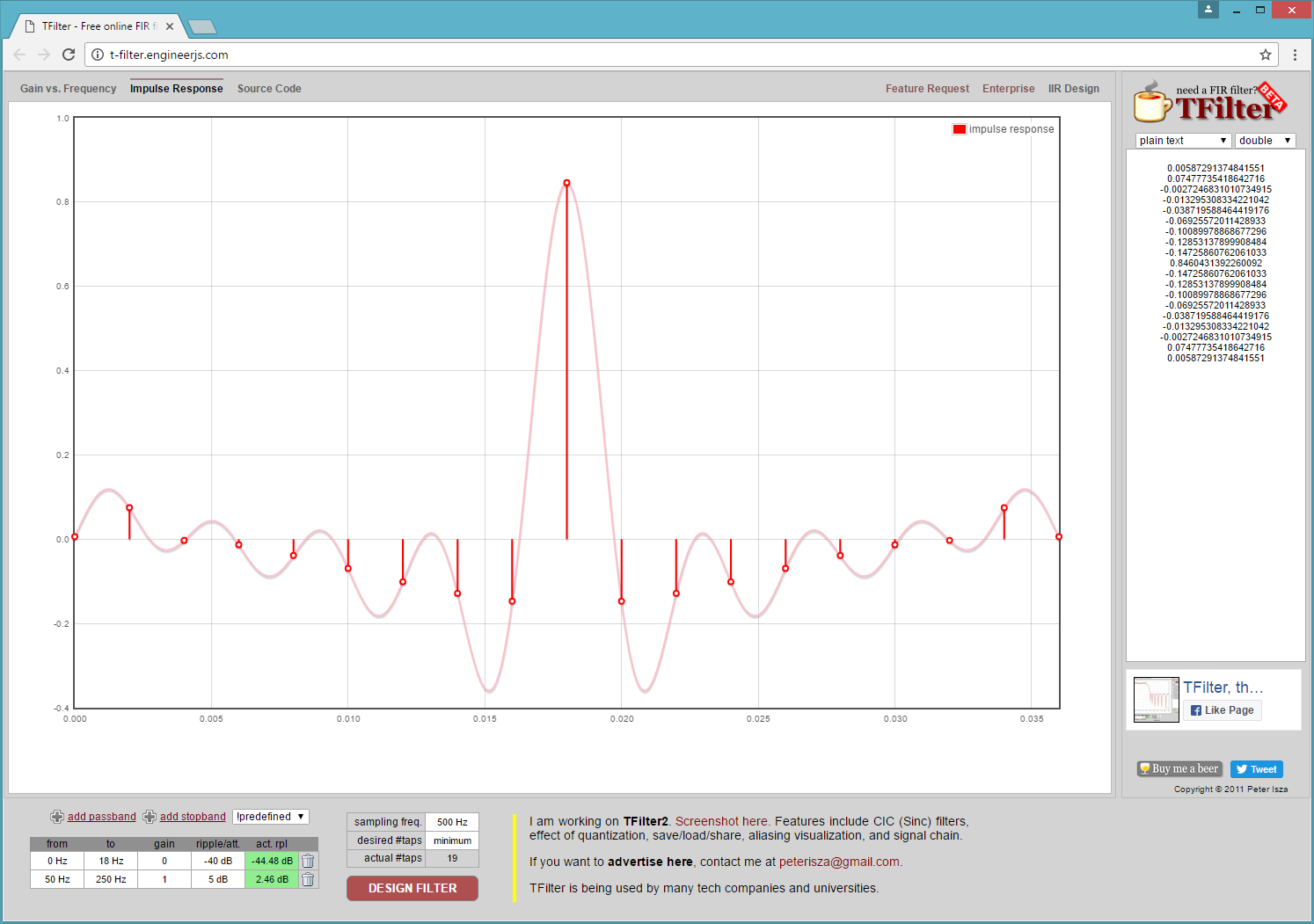
Before walking through the processing chain, we should discuss delays caused by filtering. Many types of filtering add delays to the signal being processed. If you do a lot of filtering work, you are probably well aware of this fact, but, if you are not all that experienced with filtering signals, it’s something of which you should be aware. What do I mean by delay? This simply means that if I put in a value X and I get out a value Y, how long it takes for the most impact of X to show up in Y is the delay. In the case of a FIR filter, it can be easily seen by the filter’s Impulse response plot, which, if you remember from my description of FIR filters, is a stream of 0’s with a single 1 inserted. T-Filter shows the impulse response, so you can see how X impacts Y’s output. Below is an image of the FEP’s high pass filter Impulse Response taken from the T-Filter website. Notice in the image that the maximum impact on X is exactly in the middle, and there is a point for each tap in the filter.
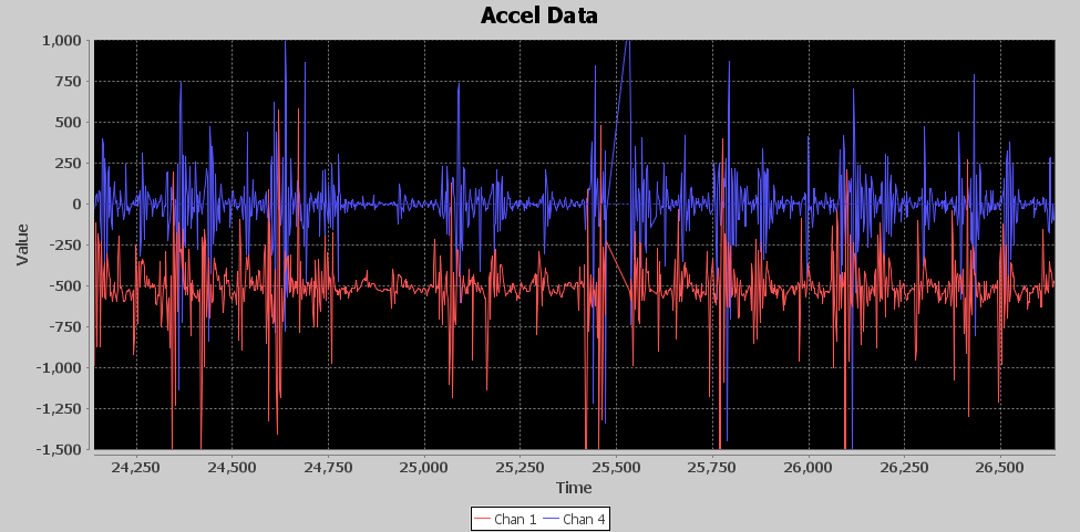
Below is a diagram of a few of the FEP’s high pass filter signals. The red signal is the input from the accelerometer or the newest sample going into the filter, the blue signal is the oldest sample in the filter’s ring buffer. There are 19 taps in the FIR filter so they represent a plot of the first and last samples in the filter window. The green signal is the value coming out of the high pass filter. So to relate to my X and Y analogy above, the red signal is X and the green signal is Y. The blue signal is delayed by 36 milliseconds in relation to the red input signal which is exactly 18 samples at 2 milliseconds, this is the window of data that the filter works on and is the Finite amount of time X affects Y.

Notice the output of the high pass filter (green signal) seems to track changes from the input at a delay of 18 milliseconds, which is 9 samples at 2 milliseconds each. So, the most impact from the input signal is seen in the middle of the filter window, which also coincides with the Impulse Response plot where the strongest effects of the 1 value input are seen at the center of the filter window.
It’s not only a FIR that adds delay. Usually, any filtering that is done on a window of samples will cause a delay, and, typically, it will be half the window length. Depending on your application, this delay may or may not have to be accounted for in your design. However, if you want to line this signal up with another unfiltered or less filtered signal, you are going to have to account for it and align it with the use of a delay component.
Front End Processor
I’ve talked at length about how to get to a final solution and all the components that made up the solution, so now let’s walk through the processing chain and see how the signal is transformed into one that reveals the punches. The FEP’s main goal is to remove bias and create an output signal that smears across the bursts of acceleration to create a wave that is higher in amplitude during increased acceleration and lower amplitude during times of less acceleration. There are four serial components to the FEP: a High Pass FIR, Attenuator, Rectifier and Smoothing via Sliding Window Average.
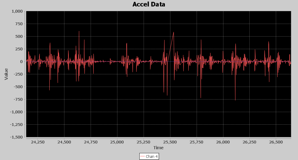
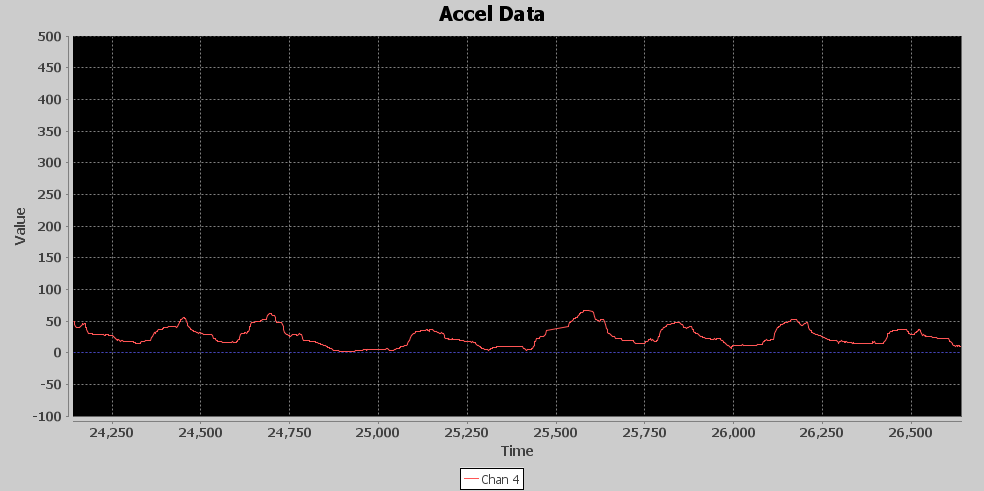
The first image is the input and output of the High Pass FIR. Since they are offset by the amount of bias, they don’t overlay very much. The red signal is the input from the accelerometer, and the blue is the output from the FIR. Notice the 1g of acceleration due to gravity is removed and slower changes in the signal are filtered out. If you look between 24,750 and 25,000 milliseconds, you can see the blue signal is more like a straight line with spikes and a slight ringing on it, while the original input has those spikes but meandering on some slow ripple.
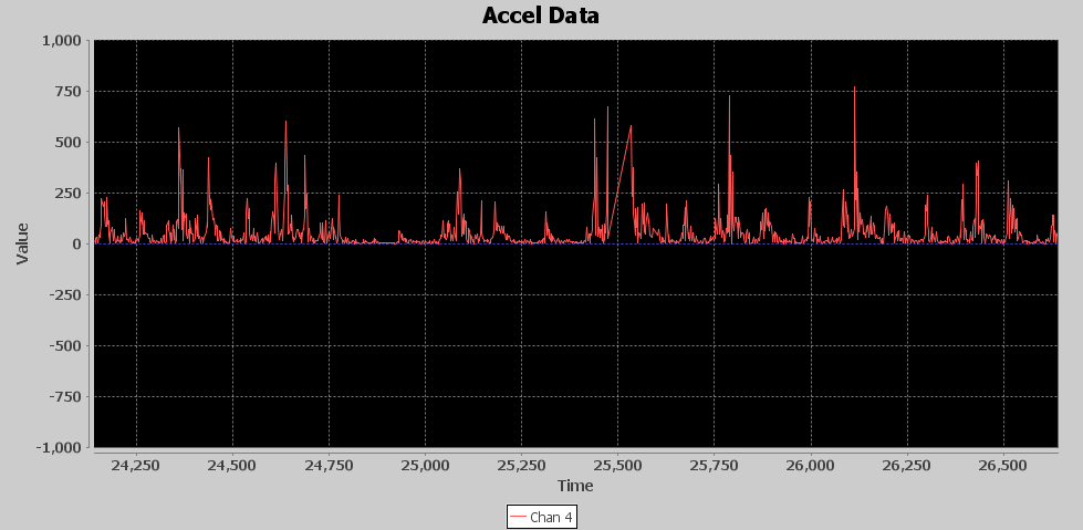
Next is the output of the attenuator. While this component works on the entire signal, it lowers the peak values of the signal, but its most important job is to squish the quieter parts of the signal closer to zero values. The image below shows the output of the attenuator, and the input was the output of the High Pass FIR. As expected, peaks are much lower but so is the quieter time. This makes it a little easier to see the acceleration bursts.
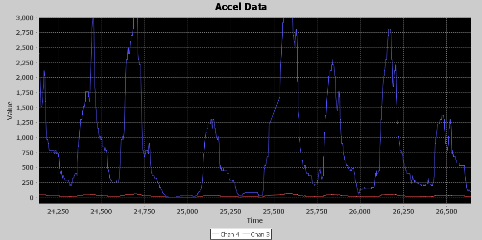
Next is the rectifier component. Its job is to turn all the acceleration energy in the positive direction so that it can be used in averaging. For example, an acceleration causing a positive spike of 1000 followed by a negative spike of 990 would yield an average of 5, while a 1000 followed by a positive of 990 would yield an average of 995, a huge difference. Below is an image of the Rectifier output. The bursts of acceleration are slightly more visually apparent, but not easily discernable. In fact, this image shows exactly why this problem is such a tough one to solve; you can clearly see how resonant shaking of the base causes the pattern to change during punch energy being added. The left side is lower and more frequent peaks, the right side has higher but less frequent peaks.
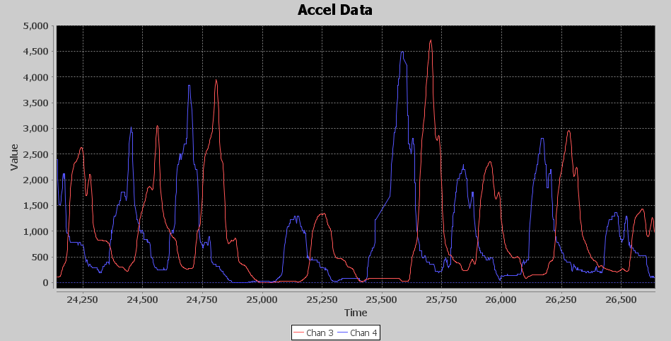
The 49 value sliding window is the final step in the FEP. While we have done subtle changes to the signal that haven’t exactly made the punches jump out in the images, this final stage makes it visually apparent that the signal is well on its way of yielding the hidden punch information. The fruits of the previous signal processing magically show up at this stage. Below is an image of the Sliding Window average. The blue signal is its input or the output of the Rectifier, and the red signal is the output of the sliding window. The red signal is also the final output of the FEP stage of processing. Since it is a window, it has a delay associated with it. Its approximately 22 samples or 44 milliseconds on average. It doesn’t always look that way because sometimes the input signal spikes are suddenly tall with smaller ringing afterwards. Other times there are some small spikes leading up to the tall spikes and that makes the sliding window average output appear inconsistent in its delay based on where the peak of the output shows up. Although these bumps are small, they are now representing where new acceleration energy is being introduced due to punches.

Detection Processor
Now it’s time to move on to the Detection Processor (DET). The FEP outputs a signal that is starting to show where the bursts of acceleration are occurring. The DET’s job will be to enhance this signal and employ an algorithm to detect where the punches are occurring.
The first stage of the DET is an attenuator. Eventually, I want to add exponential gain to the signal to really pull up the peaks, but, before doing that, it is important to once again squish down the lower values towards zero and lower the peaks to keep from generating values too large to process in the rest of the DET chain. Below is an image of the output from the attenuator stage, it looks just like the signal output from the FEP, however notice the signal level peaks were above 100 from the FEP, and now peaks are barely over 50. The vertical scale is zoomed in with the max amplitude set to 500 so you can see that there is a viable signal with punch information.
With the signal sufficiently attenuated, it’s time to create the magic. The Magnitude Square function is where it all comes together. The attenuated signal carries the tiny seeds from which I’ll grow towering Redwoods. Below is an image of the Mag Square output, the red signal is the attenuated input, and the blue signal is the mag square output. I’ve had to zoom out to a 3,000 max vertical, and, as you can see, the input signal almost looks flat, yet the mag square was able to pull out unmistakable peaks that will aid the detection algorithm to pick out punches. You might ask why not just use these giant peaks to detect punches. One of the reasons I’ve picked this area of the signal to analyze is to show you how the amount of acceleration can vary greatly as you can see the peak between 25,000 and 25,250 is much smaller than the surrounding peaks, which makes pure thresholding a tough chore.
Next, I decided to put a Low Pass filter to try to remove any fast changing parts of the signal since I’m looking for events that occur in the 2 to 4 Hz range. It was tough on T-Filter to create a tight low pass filter with a 0 to 5 Hz band pass as it was generating filters with over 100 taps, and I didn’t want to take that processing hit, not to mention I would then need a 64-bit accumulator to hold the sum. I relaxed the band pass with a 0 to 19 Hz range and the band stop at 100 to 250 Hz. Below is an image of the low pass filter output. The blue signal is the input, and the red signal is the delayed output. I used this image because it allows the input and output signal to be seen without interfering with each other. The delay is due to 6 sample delay of the low pass FIR, but I have also introduced a 49 sample delay to this signal so that it is aligned in the center of the 99 sample sliding window average that follows in the processing chain. So it is delayed by a total of 55 samples or 110 milliseconds. In this image, you can see the slight amplification of the slow peaks by their height and how it is smoothed as the faster changing elements are attenuated. Not a lot going on here but the signal is a little cleaner, Earl Muntz might suggest I cut the low pass filter out of the circuit, and it might very well work without it.
The final stage of the signal processing is a 99 sample sliding window average. I built into the sliding window average the ability to return the sample in the middle of the window each time a new value is added and that is how I produced the 49 sample delayed signal in the previous image. This is important because the detection algorithm is going to have 2 parallel signals passed into it, the output of the 99 sliding window average and the 49 sample delayed input into the sliding window average. This will perfectly align the un-averaged signal in the middle of the sliding window average. The averaged signal is used as a dynamic threshold for the detection algorithm to use in its detection processing. Here, once again, is the image of the final output from the DET.

In the image, the green and yellow signals are inputs to the detection algorithm, and the blue and red are outputs. As you can see, the green signal, which is a 49 samples delayed, is aligned perfectly with the yellow 99 sliding window average peaks. The detection algorithm monitors the crossing of the yellow by the green signal. This is accomplished by both maximum and minimum start guard state that verifies the signal has moved enough in the minimum or maximum direction in relation to the yellow signal and then switches to a state that monitors the green signal for enough change in direction to declare a maximum or minimum. When the peak start occurs and it’s been at least 260ms since the last detected peak, the state switches to monitor for a new peak in the green signal and also makes the blue spike seen in the image. This is when a punch count is registered. Once a new peak has been detected, the state changes to look for the start of a new minimum. Now, if the green signal falls below the yellow by a delta of 50, the state changes to look for a new minimum of the green signal. Once the green signal minimum is declared, the state changes to start looking for the start of a new peak of the green signal, and a red spike is shown on the image when this occurs.
Again, I’ve picked this time in the recorded data because it shows how the algorithm can track the punches even during big swings in peak amplitude. What’s interesting here is if you look between the 24,750 and 25,000 time frame, you can see the red spike detected a minimum due to the little spike upward of the green signal, which means the state machine started to look for the next start of peak at that point. However, the green signal never crossed the yellow line, so the start of peak state rode the signal all the way down to the floor and waited until the cross of the yellow line just before the 25,250 mark to declare the next start of peak. Additionally, the peak at the 25,250 mark is much lower than the surrounding peaks, but it was still easily detected. Thus, the dynamic thresholding and the state machine logic allows the speed bag punch detector algorithm to “Roll with the Punches”, so to speak.