Lessons in Algorithms
 Nate, barryjh
Creating the Solution
As it goes in all projects, now that you know what should be done, the realization that there isn’t enough time sets in. Since I didn't have the real hardware and needed to be able to visually see the output of my algorithm, I started working it out quickly in Java on my PC. I built in a way to plot the results of the waveforms on my screen. I’ve been using NetBeans for years to do Java development, so I started a new speed bag project. I always use JFreeChart library to plot data, so I added it to my project. Netbeans has a really good IDE and built-in GUI designer. All I had to do was create a GUI layout with a blank panel where I want the JFreeChart to display and then, at run time, create the JFreeChart object and add it to the panel. All the oscilloscope diagrams in this article were created by the JFreeChart display. Here is an image from my quick and dirty oscilloscope GUI design page.

This algorithm was needed in a hurry, so my first pass is to be very object oriented and use every shortcut afforded me by using Java. Then, I’ll make it more C like in nature as I nail down the algorithm sequence. I jumped right in and plotted the X, Y and Z wave forms as they came from the recorded results. Once I got a look at the raw data, I decided to remove any biases first (i.e., gravity) and then sum the square of each waveform and take the square root. I added some smoothing by way of averaging a small number of values and employed a minimum time between threshold crossings to help filter out spikes. All in all, this seemed to make the data even worse on the plot. I decided to throw away X and Y, since I didn’t know in what orientation it was mounted and if it would be mounted the same on different speed bag platforms anyway. To my horror, even with just the Z axis, it still just looked like a mess of noise! I’m seeing peaks in the data way too close together. Only my minimum time between thresholds gate is helping make some sense of the punch count, but there really isn’t anything concrete in the data. Something's not adding up. What am I missing?
Below is an image of the runF1 waveform. The blue signal is the filtered z axis, and the red line is a threshold for counting punches. As I mentioned, if it weren’t for my 250ms minimum between punch detections, my counter would be going crazy. Notice the way I have introduced two 5 millisecond delays in my runF1() processing so thresholding would be a little better if the red line were moved to the right by 10 milliseconds. I’ll talk more about aligning signals later in this article, but you can see in this image how time aligning signals is crucial for getting accurate results.
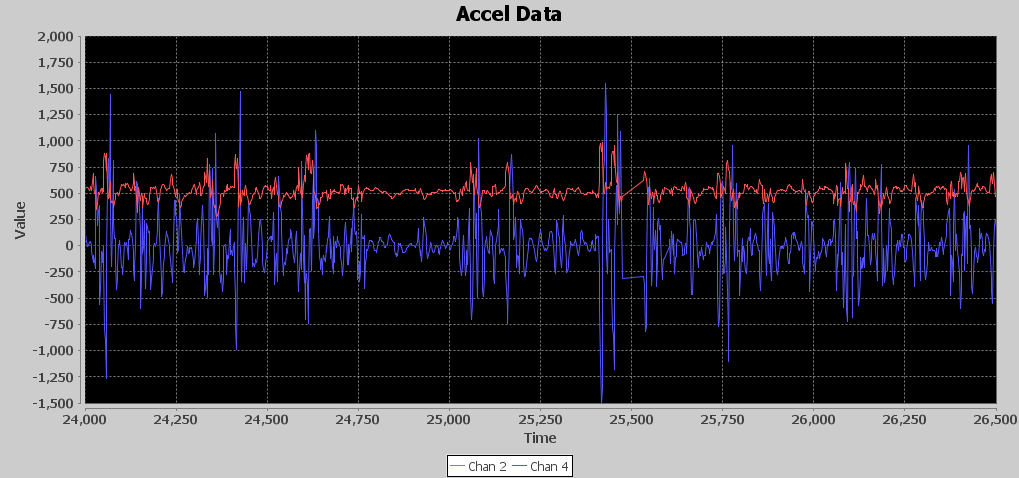
If you look at the virtual oscilloscope output, you can see that between millisecond 25,000 and 26,000, which is 1 second in time, there are around nine distinct acceleration events. No way Nate is throwing nine punches in a second. Exactly how many punches should I expect to see per second? Back to the drawing board. I need another approach. Remember humility is your friend; if you just rush in on your high horse you usually will be knocked off it in a hurry.