Graph Sensor Data with Python and Matplotlib
Introduction to Matplotlib
Matplotlib is a wonderful tool for creating quick and professional graphs with Python. It operates very similarly to the MATLAB plotting tools, so if you are familiar with MATLAB, matplotlib is easy to pick up.
The Absolute Basics
The easiest way to make a graph is to use the pyplot module within matplotlib. We can provide 2 lists of numbers to pyplot, and it will create a graph with them. Note that the 2 lists need to have the same length (same number of elements). The first list is a collection of numbers in the X domain, and the second is a collection of numbers in the Y range.
Use your favorite text editor or Python IDE to enter the following code:
language:python
import matplotlib.pyplot as plt

xs = [0, 1, 2, 3, 4, 5, 6, 7]
ys = [1, 0.3, -2.3, 5.1, 7.6, -0.2, -1.8, 4]

plt.plot(xs, ys)
plt.show()
Save the program (e.g. as myplot.py). Run it with:
language:shell
python myplot.py
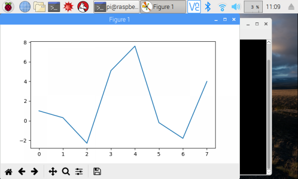
You should see the graph appear in a new window.
While the basic line graph is likely the most used graph, matplotlib is also capable of plotting other types of graphs, including bar, histogram, scatter, and pie (among others).
If you want to save the image, you can click on the Save icon in the plot's window.
Note that the points from the xs and ys lists are related to each other. The fist element of xs (i.e. xs[0]) and the first element of ys (i.e. ys[0]) make up the first point, (0, 1) in this instance. Pyplot automatically draws a line between one point and the next in the series.
Formatting
Like any good graph-creation tool, pyplot lets you change the formatting of your graphs with legends, titles, and labels. Let's create a new plot:
language:python
import matplotlib.pyplot as plt
import math

# Create sinewaves with sine and cosine
xs = [i / 5.0 for i in range(0, 50)]
y1s = [math.sin(x) for x in xs]
y2s = [math.cos(x) for x in xs]

# Plot both sinewaves on the same graph
plt.plot(xs, y1s, 'r^', label='sin(x)')
plt.plot(xs, y2s, 'b--', label='cos(x)')

# Adjust the axes' limits: [xmin, xmax, ymin, ymax]
plt.axis([-1, 11, -1.5, 1.5])

# Give the graph a title and axis labels
plt.title('My Sinewaves')
plt.xlabel('Radians')
plt.ylabel('Value')

# Show a legend
plt.legend()

# Save the image
plt.savefig('sinewaves.png')

# Draw to the screen
plt.show()
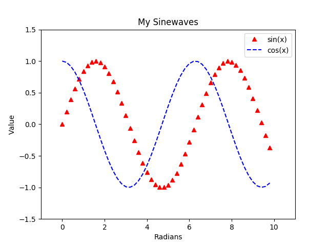
Save and run this code. You should see two different sinewaves overlapping each other.
Here, you might notice a few differences from the first plot. We are creating two different plots, and by calling plt.plot() twice, we can draw those plots on the same set of axes (i.e. on the same graph). To create those plots, we use the range() function to generate numbers from 0 to 50 (exclusive) and divide each number by 5. This creates a series of numbers from 0 to 10 equally spaced by 0.2.
When it comes to formatting the graph, we have plenty of options at our fingertips. We can "zoom" by setting the limit on the axes with plt.axis(). We're able to add a title and axis labels. We can also show a legend by adding label= as an argument in the plt.plot() function call.
Additionally, if you look at our call to plt.plot(), you'll notice that we can specify how we want the plots to look with the third parameter. 'r^' says to make the points red (r) and appear as triangles (^). 'b--' says to make the plot blue (b) and use a dashed line (--). See the Notes section in the plot documentation to see the various options for formatting strings.
Finally, we were able to create the image above by calling plt.savefig(). This saves the current figure as an image in the same directory as the Python code (and we can do it programmatically!)
Refer to the pyplot documentation to see all the available functions for plotting and formatting.
Subplots
Sometimes, you may want to display multiple plots on a single image (or figure). To accomplish this, we can use supblots:
language:python
import matplotlib.pyplot as plt
import math

# Create sinewaves with sine and cosine
xs = [i / 5.0 for i in range(0, 50)]
y1s = [math.sin(x) for x in xs]
y2s = [math.cos(x) for x in xs]

# Explicitly create our figure and subplots
fig = plt.figure()
ax1 = fig.add_subplot(2, 1, 1)
ax2 = fig.add_subplot(2, 1, 2)

# Draw our sinewaves on the different subplots
ax1.plot(xs, y1s)
ax2.plot(xs, y2s)

# Adding labels to subplots is a little different
ax1.set_title('sin(x)')
ax1.set_xlabel('Radians')
ax1.set_ylabel('Value')
ax2.set_title('cos(x)')
ax2.set_xlabel('Radians')
ax2.set_ylabel('Value')

# We can use the subplots_adjust function to change the space between subplots
plt.subplots_adjust(hspace=0.6)

# Draw all the plots!
plt.show()
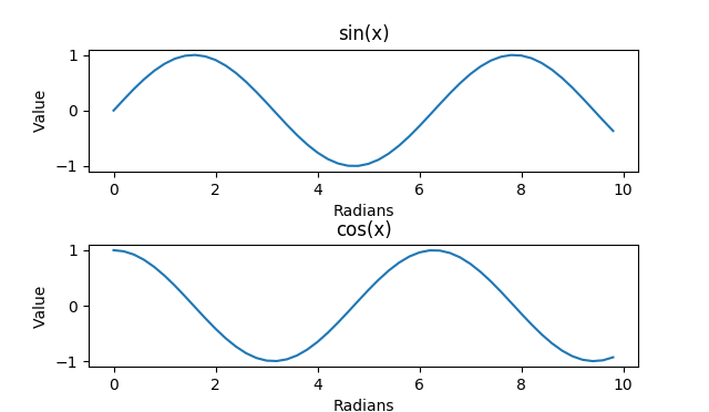
Run this, and you should get two sinewaves, each in its own subplot.
Up to this point, we had been calling plt.plot() to draw on the canvas. In reality, this is a shortcut to create a figure object (the background where we draw our plots) and then create a set of axes on a single plot on that figure. To create subplots, we need to explicitly create that figure so that we get a handle to it. We can then use the fig handle to create subplots on the figure.
The add_subplot() function must be given a series of numbers (or a 3-digit integer) representing the height, width, and position of the subplot to create. (2, 1, 1) says to create a 2x1 subplot grid (2 high, 1 across) and return a handle to the first subplot (the one on top). (2, 1, 2) similarly says that in the same 2x1 gird, return a handle to the second subplot (the one on bottom). We name these handles ax1 and ax2 (for axes 1 and 2).
To learn more about how to create subplots, see the add_subplot definition.
We then draw our sinewaves on the axes directly (rather than using the shortcut plt.plot()). We also add labels to everything. Without any adjustments, the labels would be hidden by the axes by default. To account for this, we set the hspace parameter, which controls the amount of height between subplots. Feel free to play around with the other parameters in subplots_adjust to see how they work.


