Python is a wonderful high-level programming language that lets us quickly capture data, perform calculations, and even make simple drawings, such as graphs. Several graphical libraries are available for us to use, but we will be focusing on matplotlib in this guide. Matplotlib was created as a plotting tool to rival those found in other software packages, such as MATLAB. Creating 2D graphs to demonstrate mathematical concepts, visualize statistics, or monitor sensor data can be accomplished in just a few lines of code with matplotlib.
The Raspberry Pi is a great platform for connecting sensors (thanks to the exposed GPIO pins), collecting data via Python, and displaying live plots on a monitor.
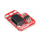
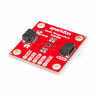
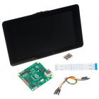
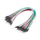
To work through the activities in this tutorial, you will need a few pieces of hardware:
You have several options when it comes to working with the Raspberry Pi. Most commonly, the Pi is used as a standalone computer, which requires a monitor, keyboard, and mouse (listed below). To save on costs, the Pi can also be used as a headless computer (without a monitor, keyboard, and mouse).
Note that for this tutorial, you will need access to the Raspbian (or other Linux) graphical interface (known as the desktop). As a result, the two recommended ways to interact with your Pi is through a monitor, keyboard, and mouse or by using Virtual Network Computing (VNC).
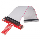
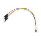
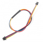
At the bare minimum, you need a breadboard and some jumper wires to connect the Pi to the TMP102 sensor. However, the Pi Wedge and some M/M jumper wires may make prototyping easier.
If you aren't familiar with the following concepts, we recommend checking out these tutorials before continuing:
To begin, you will need to flash an image of the Raspbian operating system (OS) onto an SD card (if you have not done so already). You have a couple of options:
OR
Once you have installed the OS for your Raspberry Pi, follow the steps in Configure Your Pi. If given the choice, choose the steps that relate to the Full Desktop setup.
We will be using Python 3 in this tutorial. At the time of writing, Python 2 was still the default version with Raspbian, which means that we will need to tell Linux that the command python should execute Python version 3.
Open a terminal and enter the following command to edit the .bashrc file:
language:shell
nano ~/.bashrc
Scroll down to the bottom of the file, and add the following (if they are not already present):
language:shell
alias python='/usr/bin/python3'
alias pip=pip3
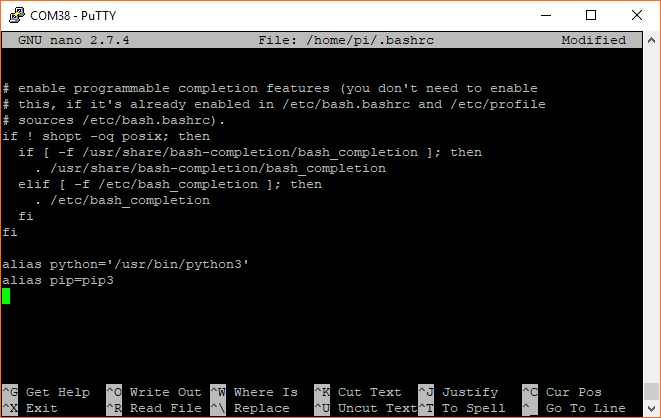
Exit out of nano with ctrl+x, press y, and press enter. Run the .bashrc script with:
language:shell
source ~/.bashrc
You can check the versions of Python and pip with:
language:shell
python --version
pip --version
Both should tell you the they are using a version of Python 3 (e.g. 3.5.3).
By default, Raspbian disables the I2C port, which we'll need to talk to the TMP102.
Bring up the Raspberry Pi configuration menu:
language:shell
sudo raspi-config
If asked to enter a password, type in the password you set for your Raspberry Pi. If you did not change it, the default password is raspberry.
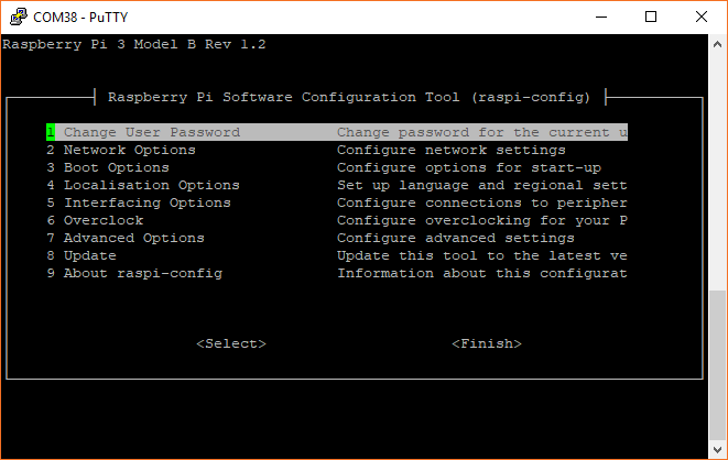
Select 5 Interfacing Options.
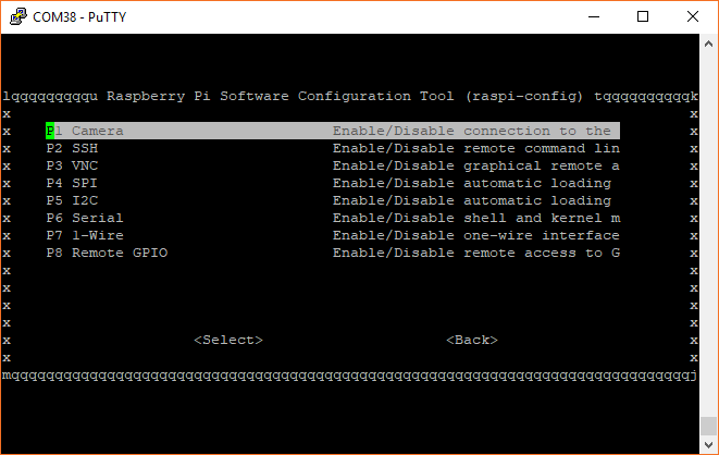
Select P5 I2C, select yes on the following screen, and press enter to enable the I2C port.
Back on the main screen, highlight Finish and press enter. A reboot is not necessary if you did not change any other options.
Like any good Linux project, we need to install a number of dependencies and libraries in order to get matplotlib to run properly. Make sure you have an Internet connection and in a terminal, enter the following commands. You may need to wait several minutes while the various packages are downloaded and installed.
language:shell
sudo apt-get update
sudo apt-get install libatlas3-base libffi-dev at-spi2-core python3-gi-cairo
pip install cairocffi
pip install matplotlib
You are now ready to build your circuit and make some graphs!
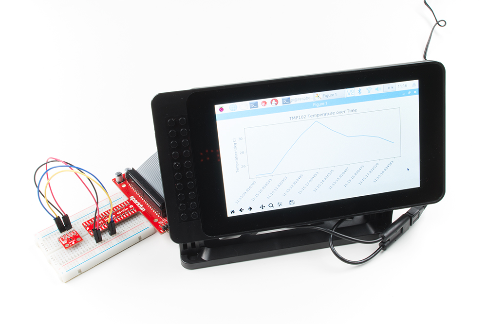
In this guide, we will read temperature data from a TMP102 temperature sensor and plot it in various ways using matplotlib. After a brief introduction to matplotlib, we will capture data before plotting it, then we'll plot temperature in real time as it is read, and finally, we'll show you how to speed up the plotting animation if you want to show faster trends.
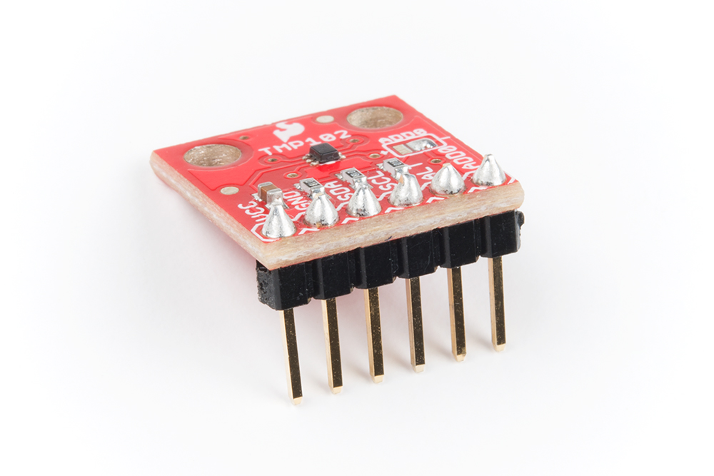
To begin, you'll need to connect the TMP102 to the Raspberry Pi, either directly or through a Pi Wedge. We recommend soldering headers onto the TMP102 if you plan to use a breadboard. If you need help, this tutorial shows you the basics of soldering.
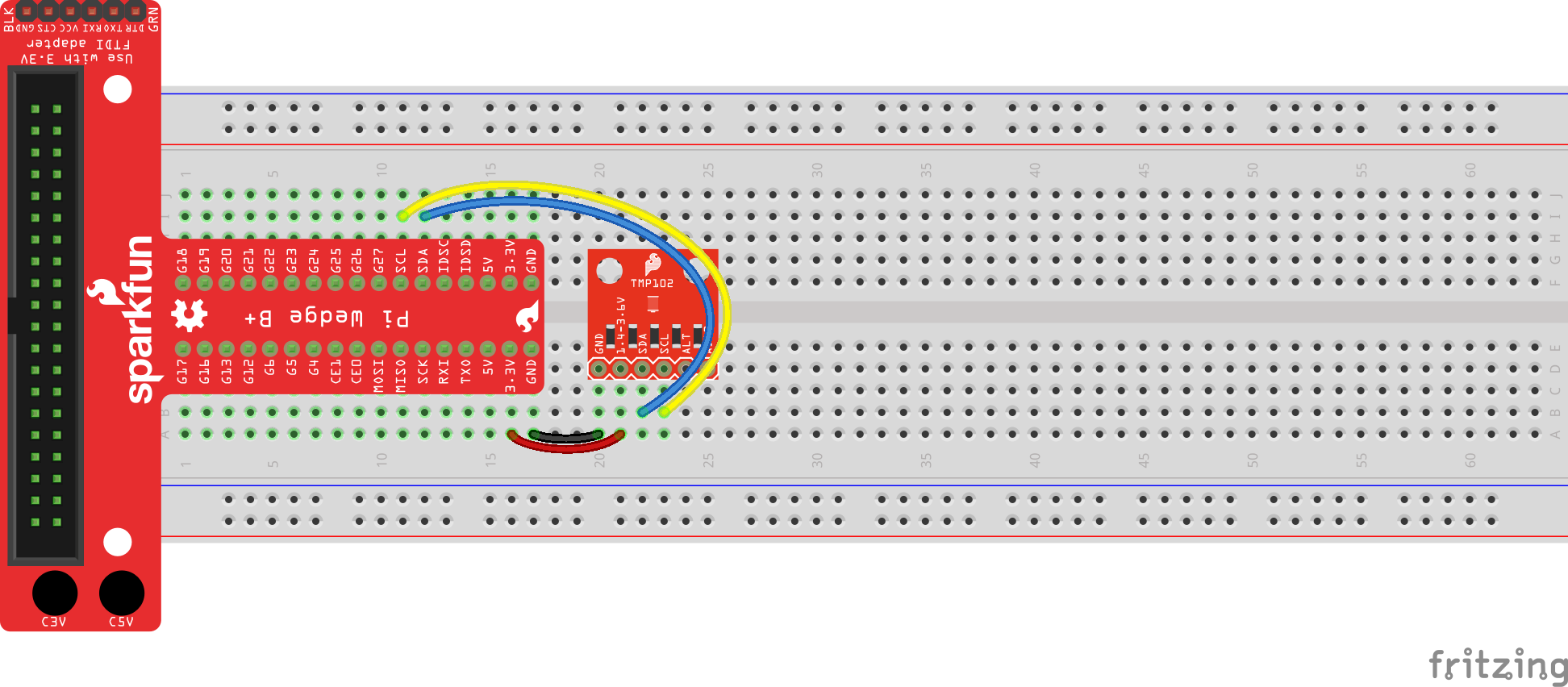
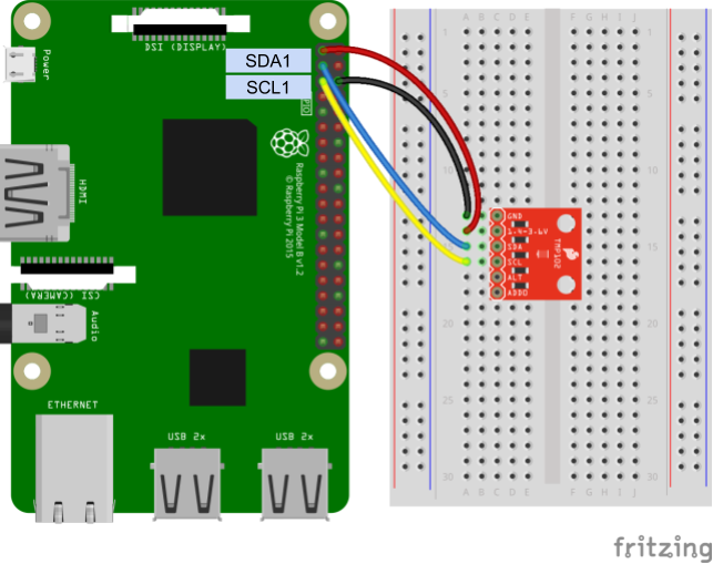
Connect the TMP102 as shown in one of the following diagrams (with or without the Pi Wedge). If you need help with layout of the Pi's GPIO headers, refer to this guide.
Connecting through a Pi Wedge:
Connecting directly to the Raspberry Pi:
Matplotlib is a wonderful tool for creating quick and professional graphs with Python. It operates very similarly to the MATLAB plotting tools, so if you are familiar with MATLAB, matplotlib is easy to pick up.
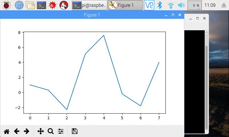
The easiest way to make a graph is to use the pyplot module within matplotlib. We can provide 2 lists of numbers to pyplot, and it will create a graph with them. Note that the 2 lists need to have the same length (same number of elements). The first list is a collection of numbers in the X domain, and the second is a collection of numbers in the Y range.
Use your favorite text editor or Python IDE to enter the following code:
language:python
import matplotlib.pyplot as plt

xs = [0, 1, 2, 3, 4, 5, 6, 7]
ys = [1, 0.3, -2.3, 5.1, 7.6, -0.2, -1.8, 4]

plt.plot(xs, ys)
plt.show()
Save the program (e.g. as myplot.py). Run it with:
language:shell
python myplot.py
You should see the graph appear in a new window.
While the basic line graph is likely the most used graph, matplotlib is also capable of plotting other types of graphs, including bar, histogram, scatter, and pie (among others).
If you want to save the image, you can click on the Save icon in the plot's window.
Note that the points from the xs and ys lists are related to each other. The fist element of xs (i.e. xs[0]) and the first element of ys (i.e. ys[0]) make up the first point, (0, 1) in this instance. Pyplot automatically draws a line between one point and the next in the series.
Like any good graph-creation tool, pyplot lets you change the formatting of your graphs with legends, titles, and labels. Let's create a new plot:
language:python
import matplotlib.pyplot as plt
import math

# Create sinewaves with sine and cosine
xs = [i / 5.0 for i in range(0, 50)]
y1s = [math.sin(x) for x in xs]
y2s = [math.cos(x) for x in xs]

# Plot both sinewaves on the same graph
plt.plot(xs, y1s, 'r^', label='sin(x)')
plt.plot(xs, y2s, 'b--', label='cos(x)')

# Adjust the axes' limits: [xmin, xmax, ymin, ymax]
plt.axis([-1, 11, -1.5, 1.5])

# Give the graph a title and axis labels
plt.title('My Sinewaves')
plt.xlabel('Radians')
plt.ylabel('Value')

# Show a legend
plt.legend()

# Save the image
plt.savefig('sinewaves.png')

# Draw to the screen
plt.show()
Save and run this code. You should see two different sinewaves overlapping each other.
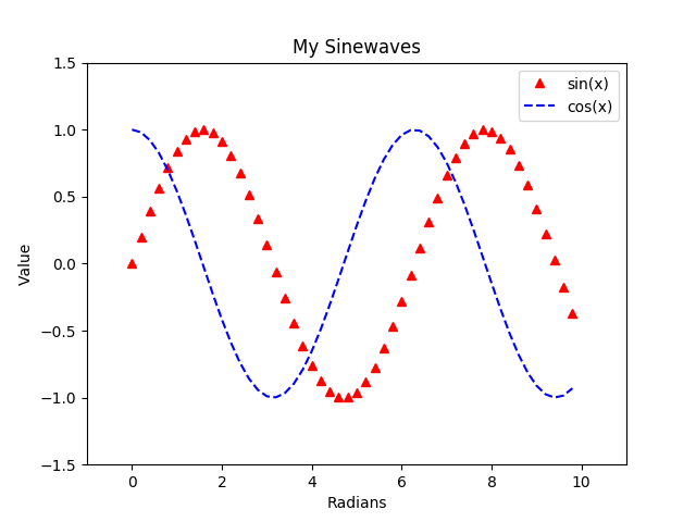
Here, you might notice a few differences from the first plot. We are creating two different plots, and by calling plt.plot() twice, we can draw those plots on the same set of axes (i.e. on the same graph). To create those plots, we use the range() function to generate numbers from 0 to 50 (exclusive) and divide each number by 5. This creates a series of numbers from 0 to 10 equally spaced by 0.2.
When it comes to formatting the graph, we have plenty of options at our fingertips. We can "zoom" by setting the limit on the axes with plt.axis(). We're able to add a title and axis labels. We can also show a legend by adding label= as an argument in the plt.plot() function call.
Additionally, if you look at our call to plt.plot(), you'll notice that we can specify how we want the plots to look with the third parameter. 'r^' says to make the points red (r) and appear as triangles (^). 'b--' says to make the plot blue (b) and use a dashed line (--). See the Notes section in the plot documentation to see the various options for formatting strings.
Finally, we were able to create the image above by calling plt.savefig(). This saves the current figure as an image in the same directory as the Python code (and we can do it programmatically!)
Refer to the pyplot documentation to see all the available functions for plotting and formatting.
Sometimes, you may want to display multiple plots on a single image (or figure). To accomplish this, we can use supblots:
language:python
import matplotlib.pyplot as plt
import math

# Create sinewaves with sine and cosine
xs = [i / 5.0 for i in range(0, 50)]
y1s = [math.sin(x) for x in xs]
y2s = [math.cos(x) for x in xs]

# Explicitly create our figure and subplots
fig = plt.figure()
ax1 = fig.add_subplot(2, 1, 1)
ax2 = fig.add_subplot(2, 1, 2)

# Draw our sinewaves on the different subplots
ax1.plot(xs, y1s)
ax2.plot(xs, y2s)

# Adding labels to subplots is a little different
ax1.set_title('sin(x)')
ax1.set_xlabel('Radians')
ax1.set_ylabel('Value')
ax2.set_title('cos(x)')
ax2.set_xlabel('Radians')
ax2.set_ylabel('Value')

# We can use the subplots_adjust function to change the space between subplots
plt.subplots_adjust(hspace=0.6)

# Draw all the plots!
plt.show()
Run this, and you should get two sinewaves, each in its own subplot.
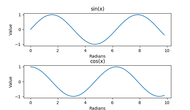
Up to this point, we had been calling plt.plot() to draw on the canvas. In reality, this is a shortcut to create a figure object (the background where we draw our plots) and then create a set of axes on a single plot on that figure. To create subplots, we need to explicitly create that figure so that we get a handle to it. We can then use the fig handle to create subplots on the figure.
The add_subplot() function must be given a series of numbers (or a 3-digit integer) representing the height, width, and position of the subplot to create. (2, 1, 1) says to create a 2x1 subplot grid (2 high, 1 across) and return a handle to the first subplot (the one on top). (2, 1, 2) similarly says that in the same 2x1 gird, return a handle to the second subplot (the one on bottom). We name these handles ax1 and ax2 (for axes 1 and 2).
To learn more about how to create subplots, see the add_subplot definition.
We then draw our sinewaves on the axes directly (rather than using the shortcut plt.plot()). We also add labels to everything. Without any adjustments, the labels would be hidden by the axes by default. To account for this, we set the hspace parameter, which controls the amount of height between subplots. Feel free to play around with the other parameters in subplots_adjust to see how they work.
In the Python Programming Tutorial: Getting Started with the Raspberry Pi, the final example shows how to sample temperature data from the TMP102 once per second over 10 seconds and then save that information to a comma separated value (csv) file. To start plotting sensor data, let's modify that example to collect data over 10 seconds and then plot it (instead of saving it to a file).
In order to simplify I2C reading and writing to the TMP102, we will create our own TMP102 Python module that we can load into each of our programs. Open a new file named tmp102.py:
language:shell
nano tmp102.py
Copy in the following Python code:
language:python
import smbus

# Module variables
i2c_ch = 1
bus = None

# TMP102 address on the I2C bus
i2c_address = 0x48

# Register addresses
reg_temp = 0x00
reg_config = 0x01

# Calculate the 2's complement of a number
def twos_comp(val, bits):
    if (val & (1 << (bits - 1))) != 0:
        val = val - (1 << bits)
    return val

# Read temperature registers and calculate Celsius
def read_temp():

    global bus

    # Read temperature registers
    val = bus.read_i2c_block_data(i2c_address, reg_temp, 2)
    temp_c = (val[0] << 4) | (val[1] >> 4)

    # Convert to 2s complement (temperatures can be negative)
    temp_c = twos_comp(temp_c, 12)

    # Convert registers value to temperature (C)
    temp_c = temp_c * 0.0625

    return temp_c

# Initialize communications with the TMP102
def init():

    global bus

    # Initialize I2C (SMBus)
    bus = smbus.SMBus(i2c_ch)

    # Read the CONFIG register (2 bytes)
    val = bus.read_i2c_block_data(i2c_address, reg_config, 2)

    # Set to 4 Hz sampling (CR1, CR0 = 0b10)
    val[1] = val[1] & 0b00111111
    val[1] = val[1] | (0b10 << 6)

    # Write 4 Hz sampling back to CONFIG
    bus.write_i2c_block_data(i2c_address, reg_config, val)

    # Read CONFIG to verify that we changed it
    val = bus.read_i2c_block_data(i2c_address, reg_config, 2)
Save the code with ctrl + x, press y, and press enter. This allows us to call the init() and read_temp() functions to easily get temperature (in Celsius) from the TMP102.
In the same directory as the tmp102.py file, create a new file (using your favorite editor), and paste in the following code:
language:python
import time
import datetime as dt
import matplotlib.pyplot as plt
import tmp102

# Create figure for plotting
fig = plt.figure()
ax = fig.add_subplot(1, 1, 1)
xs = []
ys = []

# Initialize communication with TMP102
tmp102.init()

# Sample temperature every second for 10 seconds
for t in range(0, 10):

    # Read temperature (Celsius) from TMP102
    temp_c = round(tmp102.read_temp(), 2)

    # Add x and y to lists
    xs.append(dt.datetime.now().strftime('%H:%M:%S.%f'))
    ys.append(temp_c)

    # Wait 1 second before sampling temperature again
    time.sleep(1)

# Draw plot
ax.plot(xs, ys)

# Format plot
plt.xticks(rotation=45, ha='right')
plt.subplots_adjust(bottom=0.30)
plt.title('TMP102 Temperature over Time')
plt.ylabel('Temperature (deg C)')

# Draw the graph
plt.show()
Save (give it a name like tempgraph.py) and exit. Run the program with:
language:shell
python tempgraph.py
Wait while the program collects data (about 10 seconds). Feel free to breathe on or fan near the temperature sensor to change the ambient temperature (gives you some interesting data to look at). Once the collection has finished, you should be presented with a plot showing how the temperature changed over time.
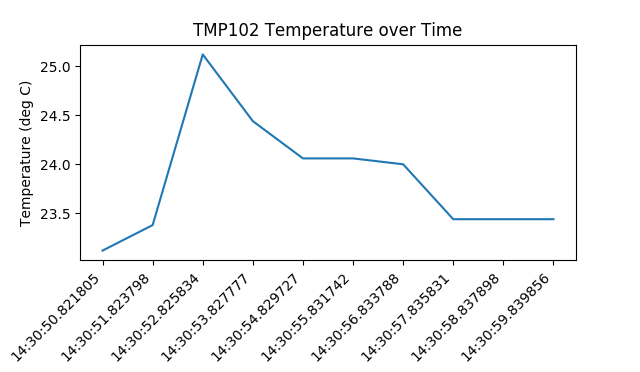
We create the graph in a very similar manner to the Formatting example in Introduction to Matplotlib. The only difference is that we build the xs and ys lists programmatically. Each second, the temperature is read from the TMP102 sensor and appended to the ys list. The local time (of the Raspberry Pi) is captured with dt.datetime.now() and appended to the xs list.
The xs and ys lists are then used to create a plot with ax.plot(xs, ys). Note that we are explicitly creating a figure and a single set of axes (instead of calling the plt.plot() shortcut). We will use the handle to the axes in the next sections when we look at animating the plot.
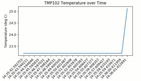
Waiting to collect measurements from a sensor before plotting it might work in some situations. Many times, you would like to be able to monitor the output of a sensor in real time, which means you can look for trends as they happen. To accomplish that, we will create an animation where a temperature sample is taken and the graph is updated immediately.
Open a new file (once again, make sure it's in the same directory as tmp102.py so that we can use the tmp102 module). Copy in the following code:
language:python
import datetime as dt
import matplotlib.pyplot as plt
import matplotlib.animation as animation
import tmp102

# Create figure for plotting
fig = plt.figure()
ax = fig.add_subplot(1, 1, 1)
xs = []
ys = []

# Initialize communication with TMP102
tmp102.init()

# This function is called periodically from FuncAnimation
def animate(i, xs, ys):

    # Read temperature (Celsius) from TMP102
    temp_c = round(tmp102.read_temp(), 2)

    # Add x and y to lists
    xs.append(dt.datetime.now().strftime('%H:%M:%S.%f'))
    ys.append(temp_c)

    # Limit x and y lists to 20 items
    xs = xs[-20:]
    ys = ys[-20:]

    # Draw x and y lists
    ax.clear()
    ax.plot(xs, ys)

    # Format plot
    plt.xticks(rotation=45, ha='right')
    plt.subplots_adjust(bottom=0.30)
    plt.title('TMP102 Temperature over Time')
    plt.ylabel('Temperature (deg C)')

# Set up plot to call animate() function periodically
ani = animation.FuncAnimation(fig, animate, fargs=(xs, ys), interval=1000)
plt.show()
Save and run the code. You should immediately see a graph that gets updated about once every second. Feel free to breathe on the sensor to see how the temperature fluctuates.
To create a real-time plot, we need to use the animation module in matplotlib. We set up the figure and axes in the usual way, but we draw directly to the axes, ax, when we want to create a new frame in the animation.
At the bottom of the code, you'll see the secret sauce to the animation:
ani = animation.FuncAnimation(fig, animate, fargs=(xs, ys), interval=1000)
FuncAnimation is a special function within the animation module that lets us automate updating the graph. We pass the FuncAnimation() a handle to the figure we want to draw, fig, as well as the name of a function that should be called at regular intervals. We called this function animate() and is defined just above our FuncAnimation() call.
Still in the FuncAnimation() parameters, we set fargs, which are the arguments we want to pass to our animate function (since we are not calling animate() directly from within our own code). Then, we set interval, which is how long we should wait between calls to animate() (in milliseconds).
animate does not have any parentheses. This is passing a reference to the function and not the result of that function. If you accidentally add parentheses to animate here, animate will be called immediately (only once), and you'll likely get an error (probably something about a tuple not being callable)!If you look at the call to animate(), you'll see that it has 3 parameters that we've defined:
def animate(i, xs, ys):
i is the frame number. This parameter is necessary when defining a function for FuncAnimation. Whenever animate() is called, i will be automatically incremented by 1. xs and ys are our lists containing a timestamp and temperature values, respectively. We told FuncAnimation() that we wanted to pass in xs and ys with the fargs parameter. Without explicitly saying we want xs and ys as parameters, we would need to use global variables for remembering the values in xs and ys.
Within animate(), we collect the temperature data and append a timestamp, just like in the previous example. We also truncate both xs and ys to keep them limited to 20 elements each. If we let the lists grow indefinitely, the timestamps would be hard to read, and we would eventually run our of memory.
In order to draw the plot, we must clear the axes with ax.clear() and then plot the line with ax.plot(). If we didn't clear them each time, plots would just be drawn on top of each other, and the whole graph would be a mess. Similarly, we need to reformat the plot for each frame.
You might notice that the plot updates only once per second (as defined by interval=1000). For some sensors, such as a temperature sensor, this is plenty fast. In fact, you may only want to sample temperature once per minute, hour, or even day. However, this sampling rate might be entirely too low for other sensors, such as distance sensors or accelerometers, where your application requires updates every few milliseconds.
Try lowering the interval to something less than 500. As it turns out, clearing and redrawing the graph is quite an intensive process for our little Pi, and you likely won't get much better than 2 or 3 updates per second. In the next section, we're going to show a technique for speeding up the drawing rate, but it means cutting some corners, such as having to set a static range and not showing timestamps.
Clearing a graph and redrawing everything can be a time-consuming process (at least in terms of computer time). As a result, our Raspberry Pi can struggle keeping up with more animations when we push it past about 2-3 frames per second (fps). To remedy that, we are going to use a trick known as blitting.
Blitting is an old computer graphics technique where several graphical bitmaps are combined into one. This way, only one needed to be updated at a time, saving the computer from having to redraw the whole scene every time.
Matplotlib allows us to enable blitting in FuncAnimation, but it means we need to re-write how some of the animate() function works. To reap the true benefits of blitting, we need to set a static background, which means the axes can't scale and we can't show moving timestamps anymore.
Open a new file in the same directory as our tmp102.py module, and copy in the following code:
language:python
import matplotlib.pyplot as plt
import matplotlib.animation as animation
import tmp102

# Parameters
x_len = 200         # Number of points to display
y_range = [10, 40]  # Range of possible Y values to display

# Create figure for plotting
fig = plt.figure()
ax = fig.add_subplot(1, 1, 1)
xs = list(range(0, 200))
ys = [0] * x_len
ax.set_ylim(y_range)

# Initialize communication with TMP102
tmp102.init()

# Create a blank line. We will update the line in animate
line, = ax.plot(xs, ys)

# Add labels
plt.title('TMP102 Temperature over Time')
plt.xlabel('Samples')
plt.ylabel('Temperature (deg C)')

# This function is called periodically from FuncAnimation
def animate(i, ys):

    # Read temperature (Celsius) from TMP102
    temp_c = round(tmp102.read_temp(), 2)

    # Add y to list
    ys.append(temp_c)

    # Limit y list to set number of items
    ys = ys[-x_len:]

    # Update line with new Y values
    line.set_ydata(ys)

    return line,

# Set up plot to call animate() function periodically
ani = animation.FuncAnimation(fig,
    animate,
    fargs=(ys,),
    interval=50,
    blit=True)
plt.show()
Save and run the code. A graph should appear with a line that animates much faster than in the previous example (i.e. around 20 fps). You should also note that there are no timestamps (i.e. the x axis does not contain any useful data), and the y axis (temperature) does not automatically scale. In fact, if you were to measure a temperature below 10° or above 40° C, it would not be drawn on the graph.
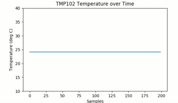
First, notice that we removed any reference to datetime or timestamps, as they won't help us with fast plotting here. Feel free to add them back in if you would like to enable some type of logging, but remember that it will slow down the animation.
Next, we set up a number of static parameters. x_len is the number of elements we want to use to create the plot. In this case, we remove elements from the beginning of the list when the plot gets to be more than 200 elements. We also set up a static y_range, which is the minimum and maximum temperature that can be displayed on the graph. To keep things fast, we don't want to redraw the y axis every frame!
In the animate() function, we only deal with the list of y (temperature) elements, as we know that the x axis doesn't change. Additionally, instead of redrawing the axes ax as in the previous example, we only update the line object, which we got a handle to earlier in the code:
line, = ax.plot(xs, ys)
The trailing comma on line, allows us to "unpack" the single-element tuple returned by the ax.plot() function. ax.plot() returns a tuple of Line2D objects (in this case, there should be only one Line2D object). As a result, we want a handle to the first object, so we use the trailing comma to say that we want the first object in the tuple and not the whole list itself. See here for more about trailing commas in Python.
After updating the Line2D object with line.set_ydata(ys), we package it into another single-element tuple with return line,, as FuncAnimation() expects our animation function to return a tuple of Line2D objects.
With these changes, we can set the blit parameter to True in our call to FuncAnimation(). This changes the way FuncAnimation() works on the back end to only update the line while leaving the background (everything else) unchanged.
Plotting sensor data can be incredibly useful if you need to make a dashboard to watch the temperature in your server room or if you want to monitor the humidity around your classroom for a science experiment. If you would like to learn more about matplotlib, here are some great resources:
If you are interested in keeping the tmp102.py file in a different directory and still access its functions, we recommend turning it into a package. Here is a good tutorial that shows you how to make your own Python package.
Looking for even more inspiration? Check out these other Raspberry Pi projects:
learn.sparkfun.com | CC BY-SA 3.0 | SparkFun Electronics | Niwot, Colorado